
This is the second post in a series on optimising mobile websites for conversions.
In Summary: Uncluttered mobile sites with minimal but meaningful information which is visible to users on the go is key to maximising conversions on mobile devices.
Mobile devices have small screens. The larger ones have about 640×960 pixel resolution (or 4in/10cm diameter). When you compare that with a desktop computer screen it’s not very big. So how do you ensure that a user on a small screen gets to see all of the things they would see on a desktop version of your site? You don’t. In this post we will be focusing on using white space as a means to making mobile websites feel intuitive and uncluttered.
Do Not Overcrowd the Screen: As covered in the last post on content prioritisation, a big part of mobile site building involves stripping out as much detail as possible. Mobile users are task oriented so they only need the details necessary to complete a task quickly. Speed is important and the way you present the information on your site will impact heavily on the speed with which a user can digest it. It might seem counter-intuitive when the screen is so small and you have so much to say but pushing lots of information and too many options at your users will push them away from a conversion. Prioritised content combined with effective use of white space leads to a better mobile experience.
Banners, Pictures & Videos: Desktop sites are generally overburdened with banners, pictures & videos but it’s easier to get away with that when you have a big screen and a fast broadband connection. Real estate is precious on a mobile device so only use small pictures – but pictures are still recommended. You can make it possible for a user to click on pictures to increase the size but it should be a user choice. Banners should be kept to an absolute minimum or even removed altogether. If you are using a banner it should only be a conversion reinforcement banner such as highlighting a delivery or returns policy. You can also use banner advertisements if that is the way you monetise your site. Videos can contribute effectively to a conversion, particularly a brand oriented one. However, where a video is not necessary and is even distracting, it should not be included. If you’re unsure, test it with a tool like Google Website Optimiser to see what impact video has for your mobile site.
Bullet Points: Desktop users generally will not read lots of text. Mobile users are even less likely to. All paragraphs of text should be removed and replaced with clear concise bullet points. Mobile user’s often read at arms length so the text should also be large enough and clear enough to facilitate this. A great way of doing so is to ensure that there’s not a lot to read. Where bands of text are unavoidable, it should be possible for users to hide or expand the text or to get more information on tabs. Use headlines that summarise the text that follows so a user can still convert without reading everything.
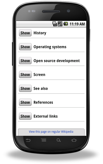
The m.wikipedia.org. site allows users to choose what text they want to see
White Space is Light Space: Dark backgrounds are a bad experience even on a desktop but on a mobile site they can be devastating to conversions. Mobile users are on the go and when they are outside in daylight situations background colour is very important. Try using a projector in a bright room with the curtains drawn and the light splashing onto the screen. If your slides have a dark background you won’t see them. If they have a white background with black text, it won’t be a problem. That is the same experience on a macro level as a user trying to use a website with a dark background on a mobile device outside. It might look cool when you’re building it in a lab, but it’s not a great experience. Users can increase the brightness of their display but that will place greater strain on the battery.
White space (also called negative space) doesn’t have to be white but it should be pale so that high contrast text and images placed against it are visible even in poor light. Using a picture as a background is also not recommended. Again, remember that users are often on the go and reading at a distance.
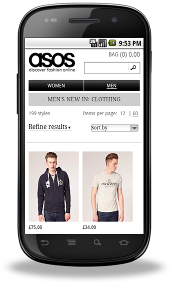
This site uses a light background and uncluttered space to great effect.
To summarise, 4 points to keep in mind when creating a layout for your mobile site:
- Mobile sites should not be cluttered
- Remove unnecessary elements which take up space and data
- Use bullet points instead of paragraphs for text
- Have a light background to your site
Mobile Website Testing Tip: When you are building your mobile site, test it in different light levels to best replicate the user experience.
The next post will be looking at how big buttons can make mobile website conversion a whole lot easier. If you have feedback, please leave a comment.
Posted by Shane Cassells, Google Conversion Team